The AAA Logo
The AAA logo is a unique signature on every piece of
visual AAA communication produced. Please follow these
basic rules to represent the AAA logo with integrity
across the country.
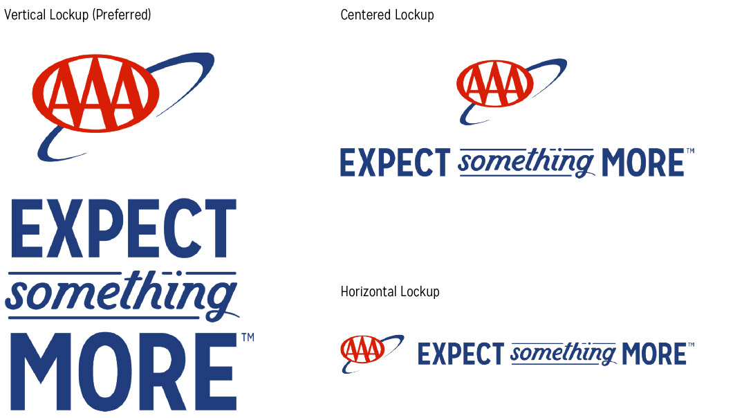
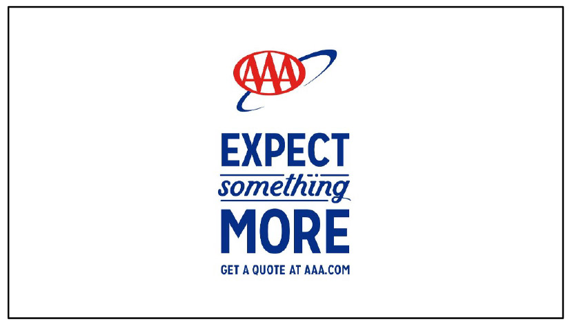
While the AAA logo with tagline is always preferred, the
secondary logo may be used in situations where space
is limited. Whenever possible, opt for the full logo, as it
serves to reinforce the AAA brand promise.
Download
Lockup Usage
• Be consistent with the lockup on multi-page ad placements.
• Lock ups should not be place over contrasty busy images.
• Same size lock ups should be used for all AAALiving materials.
• If a placement is too small for the ESM lockup, use the AAA logo on its own.
Solid Color Lockups
The reverse version of the ESM lockups should be used over image in most
situations. Make sure there is legibility against the background. The vertical version
of the reverse logo can be used locked up over the brand colors as shown.

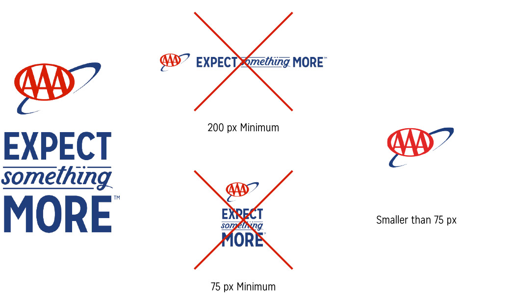
Lockup Minimum Size
The ESM lockup should be used whenever possible. However, in placements where
the lockup will be too small, use the AAA logo on its own.
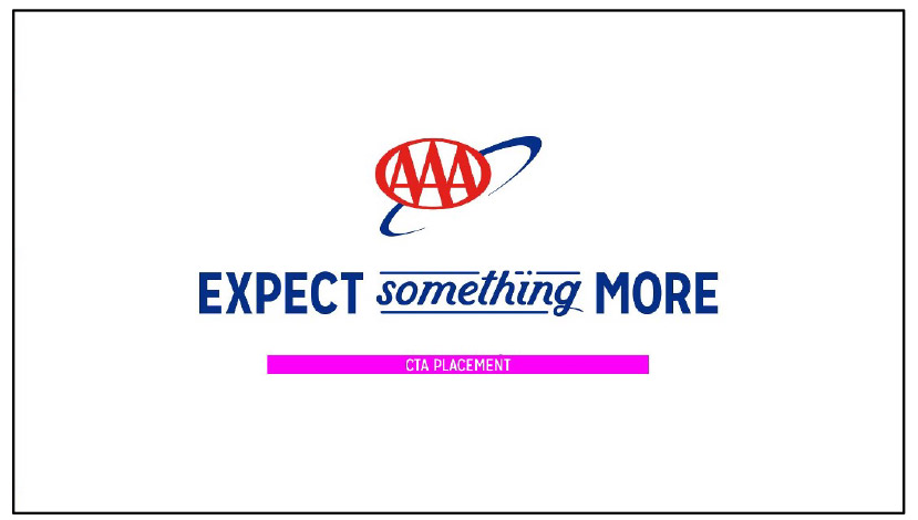
Video CTAs
Always use Mission Gothic in All-Caps. CTAs are centered beneath the lockup. For
shorter CTAs use the vertical lockup, and for longer CTAs use the centered lockup.
Social & OLA CTAs
Always use the Chevron-inspired button for social/olv CTAs. Always use Mission
Gothic in All-Caps on the button, and limit the length of the copy.

Lockup Usage CTA Placement - Video
End cards with a shorter CTA can use this Logo Lockup and Placement

End cards with a longer CTA can use this Logo Lockup and Placement
Lockup Usage - Video & TV Examples
TV (1920x1080)
OLV (1920x1080)*

*The design of the horizontal logo & ESM lockup allows for the use of a longer call to action and URL.
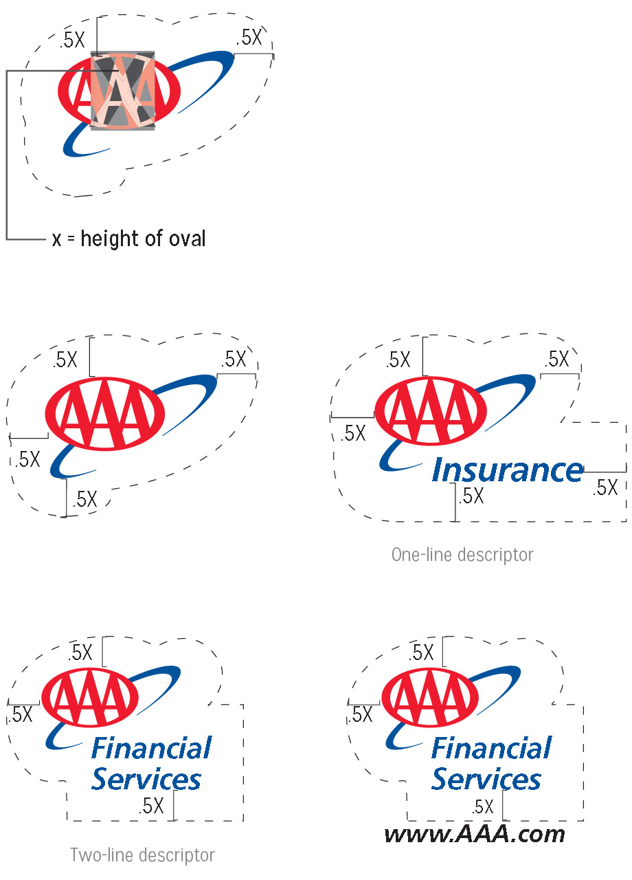
Centering the Masterbrand
Center the Masterbrand on the entire icon – oval and network as
shown – not on the oval alone.
Using Clear Space
Clarity, consistency and visibility are the most important criteria
for proper clear space. To maintain its visual integrity, do not crowd
the logo by other distracting elements such as text, titles or
images.
Recommended clear space is equal to the distance of one-half (.5)
the height (X) of the vertical center of the Masterbrand oval from
any touchpoint of the Masterbrand and its descriptor. Use a clear
space of one-quarter (.25) around the Masterbrand for websites or
mobile apps.

Social & OLA CTAs
Always use the Chevron-inspired button for social/olv CTAs. Always use Mission
Gothic in All-Caps on the button, and limit the length of the copy.