Colors
Brand Colors
At AAA we really love our brand colors. We love our AAA Red, and we
love our AAA Blue. We love them so much we never want to stray
from them. Not in printed materials, not online and not even with
painted things (yes, we’re fussy that way). Because we always want
AAA to look exactly like AAA.
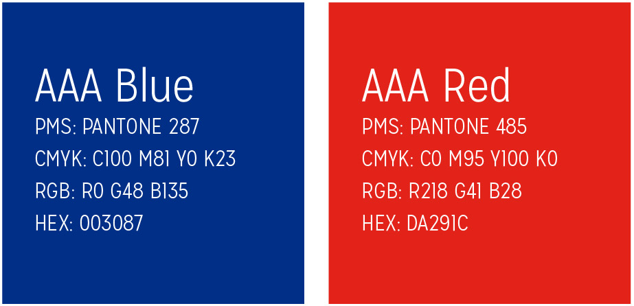
PANTONE® and PANTONE MATCHING SYSTEM® (PMS) are registered trademarks of Pantone, Inc. The colors shown on this page and
throughout this guide have not been evaluated by Pantone, Inc., for accuracy and may not match the PANTONE® Color Standards.
For accurate standards, refer to current PANTONE® publications.
Logo Colors
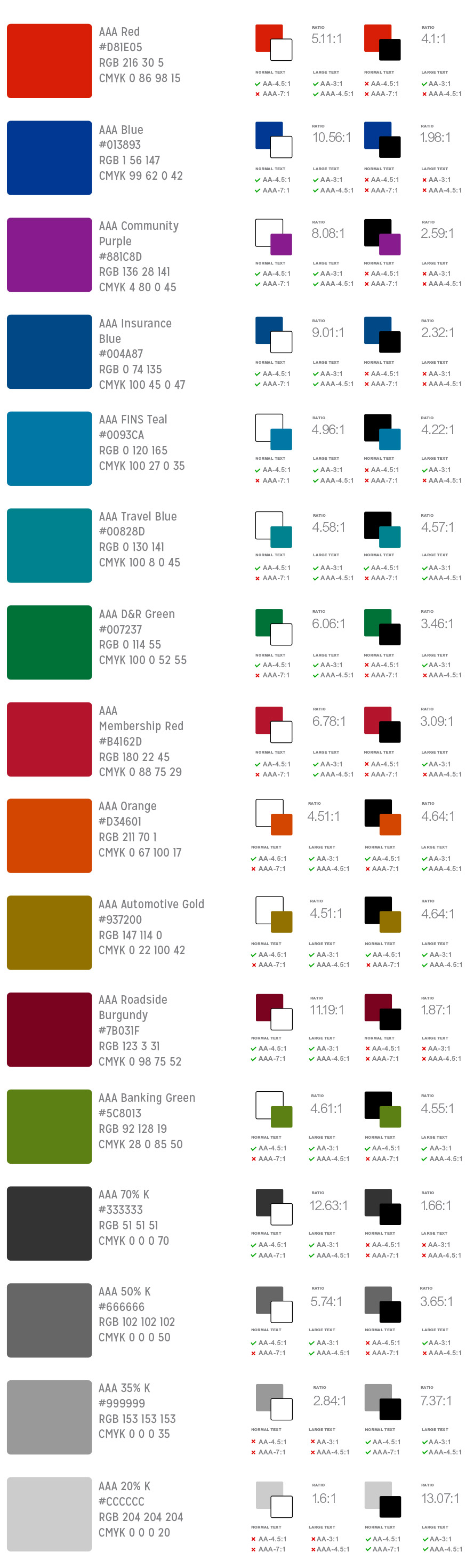
Secondary Color Usage
We’re also very attached to our secondary colors. These colors are
assigned to certain lines of business and should be every bit as
consistent in usage as our AAA Red and Blue. Be that online in
eNewsletters and emails, or printed materials or…anywhere and
everywhere.
The exception to these rules: At times we may use a secondary color
from a LOB partner or sports franchise partner brand. For instance,
the Tampa Bay Lightning Blue is different than our AAA Blue. And the
Red Wings Red is a bit different from AAA Red. But we also love our
partners, and love, as we all know, requires compromise. And so, in
these cases we adapt.
Please stay away from Day-Glow colors like bright yellows, bright
greens and bright oranges. Unless you are portraying a road safety
cone, safety vest or uber-hyper-day-glo clown, please just say “no” to
the raw and blinding brightness of The Day-Glo Way.