Typography
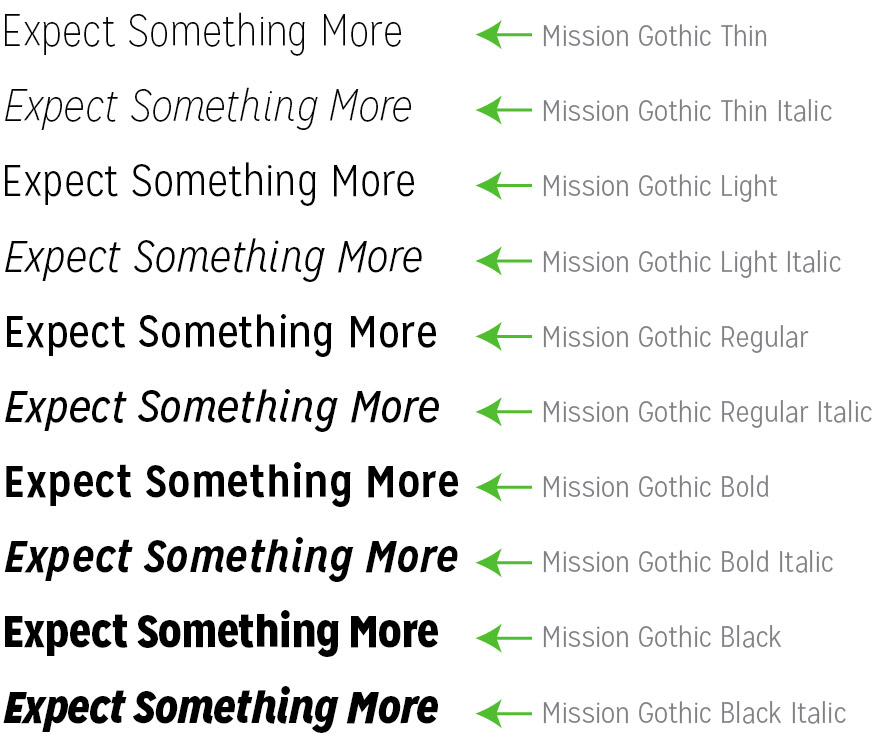
Mission Gothic is a clean, flexible typeface used for
all AAA materials. It should be used on everything
from signage to brochure copy.
All materials produced for AAA should use Mission
Gothic as a primary font.
The AAA Font

Purchase

Hanley Pro Italic is available for purchase by clicking
the Purchase button.
Alternate Typeface
If Mission Gothic is unavailable (e.g., in email, PowerPoint, Word, etc.),
use the Arial typeface.

Font Usage Don'ts
All materials produced for AAA should use only Mission Gothic.
Any typeface that appears different should be verified by the AAA
marketing team.
Do not use serif, display of script typefaces. Use only Mission Gothic.

Typography Details
The goal when creating new design for the AAA brand is to keep a
consistent design. Here are some additional typography details that
will help guide you to create interesting layouts within the
brand standards.
Pull Quotes
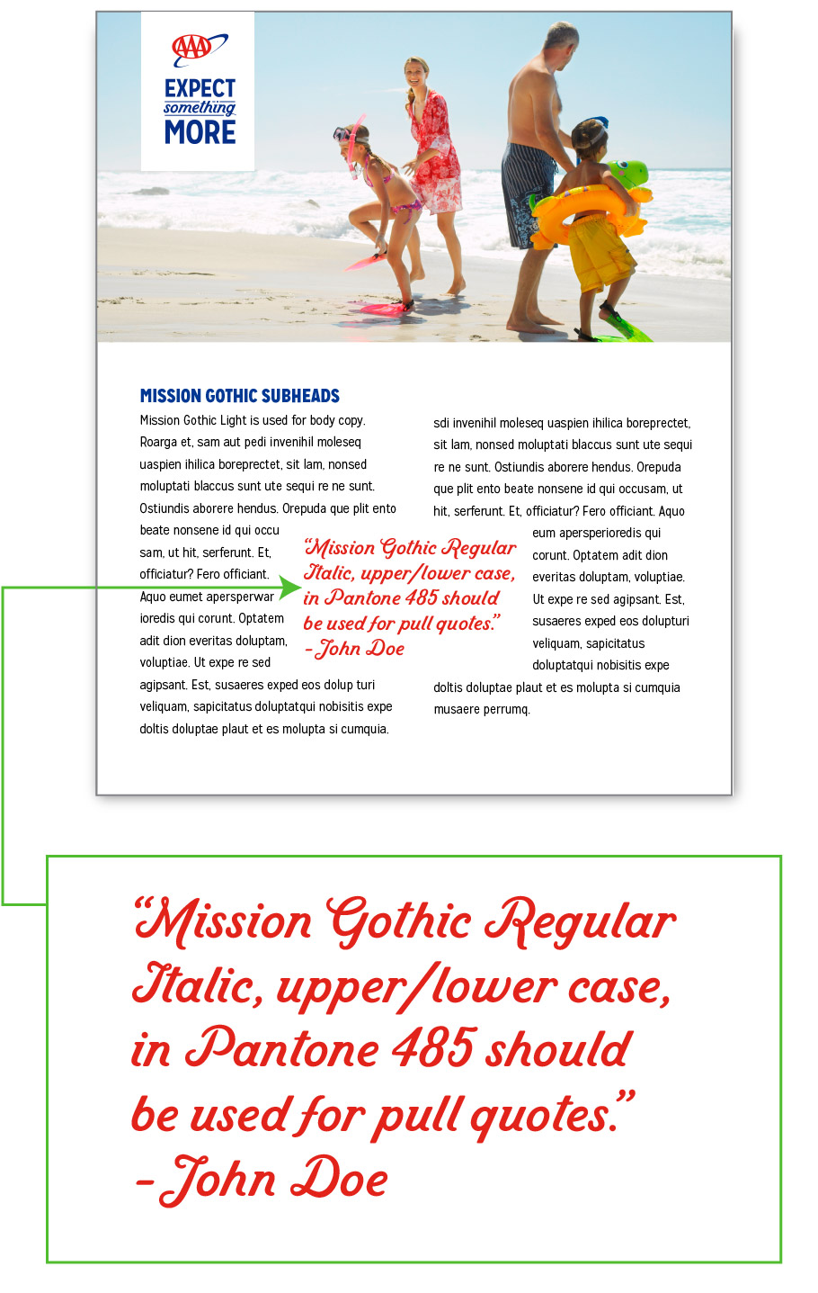
Pull quotes are a block of type within a layout that emphasize a
quoted statement. Here is an example of what a AAA pull quote
should look like:

Text Color
The text should be between full black or as light as 50% black.
The text should never be lighter than 50% black.

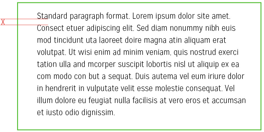
Standard Paragraph
Paragraphs should be aligned to the left with a rag right side (uneven,
not justified on the right). The leading (space between lines) should be
at least one X-height.

Bullet Points
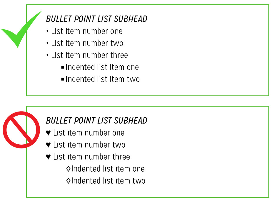
When creating a list with bullet points, the first option should be
circles and the second option should be squares, like this example:
